Minggu, 31 Mei 2009

Logitech G35 Surround Headset

Gadget Junction -Logitech G35 surround headsetWe are always seen to have away to enjoy music even personally. Logitech had introduced the G23 Surround headset for gamers.
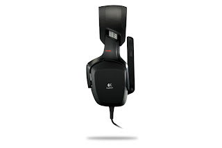
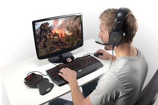
Gadget Junction -Logitech G35 surround headsetThe Logitech G35 Headset features 7.1 surround sound with built in Dolby technology that is designed to provide amazingly detailed gaming sounds with amazing sound quality.
Gadget Junction -Logitech G35 surround headsetIt also has 6 built in voice changing options, so you can have some fun whilst gaming. You don’t have to plug it into a jack anymore as its full USB connection available.
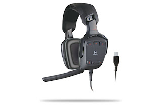
Gadget Junction -Logitech G35 surround headsetThe specification of the Logitech G23 Surround Headset.

  • 7.1 surround sound powered by Dolby® technology: Delivers a detailed soundfield—hear your enemies before they see you.
  • Ear-enclosing design: Shields you from distractions and immerses you in the game.
  • 40 mm laser-tuned speaker drivers with neodymium magnets: High performance components deliver crisp highs, lows, and everything in between.
  • Unidirectional, noise-canceling microphone: Focuses on your voice and reduces background noise.
  • Full-speed, all-digital USB connection: Delivers clean, clear audio and lets you keep your desk speakers plugged into your sound ca
The controls of the Logitech G23:
  • Three customizable G-keys: One-touch command over music, voice morphing, and more.
  • On-ear audio controls: Quick access to volume, microphone mute, and surround sound adjustments.
  • Real-time voice morphing: Select from six voices–Troll, Mutant, Alien, Giant, Cyborg, and Space Squirrel.
  • Rotating mic boom with auto-mute: Microphone mutes automatically when rotated up and out of the way.
  • Microphone mute light: Glows red when mic is muted.
  • Cable management wrap: Don't need all 10 feet of cable? Wrap it up and keep it out of the way.
System Requirements for Logitech G23
- PC with 32-bit or 64-bit Windows® XP or Windows Vista®
- 30 MB available hard drive space
- CD-ROM drive
- USB port

Technical Specifications

Headphone
- Driver: 40 mm diameter, neodymium magnet, 15 mm diameter voice coil with Ferro fluid damping
- Frequency response: 20 Hz – 20 KHz diffuse-field equalized
- Impedance: 32 ohm nominal
- Sensitivity: 90 dB SPL Ref: 1 mW, 1 KHz

Microphone
- Pickup pattern: Unidirectional (cardioid)
- Frequency response: 100 Hz – 10 KHz
- Sensitivity: -42 dBV/Pa re: 0 dB = 1 Pa, 1 KHz
- Test conditions: 3.0 V, 2.2 K ohm

Connection
- Full-Speed USB 2.0 compliant
- Cable: 10 feet/3.05 m, woven insulation


It’s a complete gaming device that ones must have even they’re novice. The Logitech is available and it cost about $ 129.90 in local stores

Kamis, 28 Mei 2009

LG Arena KM900

LG delivers Arena KM900 in a compact box. This package depicts around five LG Arena phones displaying different screen shots of the new interface. The box itself closes with a magnet and is quite straightforward and neat. Upon opening the box, LG KM900 Arena is visible right away. The LG mobile phone looks beautiful. The size is perfect, just like its weight. The front is silver (shiny) and in addition to the touchscreen monitor, it also features three touch buttons.

Furthermore, there are only four buttons on the LG smartphone the on and off button, the camera shortcut and the volume buttons. Along with the LG Arena cell phone, a data cable, a headset, a battery charger, a software CD and several instruction manuals are packed in the box. The year 2008 was very successful for LG Mobile. Not only thanks to the worldwide sales of 100 million mobile phones, but also because of having conquered a significantly larger market share.

As a result of the high sales numbers, LG has now surpassed Motorola and is well on its way to reach a solid Top 3 ranking. And with the many product introductions announced by LG Electronics, this aim may well become reality. The announced cooperation with Windows Mobile shows that LG has definitely gone into a different direction, together with the new LG user interface, it will suit everybody’s needs.

The coming three years, some 50 introductions of LG phones with Windows Mobile are scheduled. And the fact that Windows Mobile will launch a new version in the market later this year ensures the expectations are sky high. The menu of the LG Arena has changed drastically, thanks to the new S-Class User Interface. The changes are positive by all means. Not only is it beautifully designed from a graphical viewpoint, but it is also easy to work with and proves remarkably smooth.

There are four start windows Shortcuts, Widgets, Contacts and Multi media. These start screens can be changed by moving them, which will make the screen rotate like a cube. Or you can use the middle touch key to do so. A rotating 3D cube will be displayed, at which you can choose the desired screen. Furthermore, there are four shortcuts below the start screen at all times, a keypad to select a phone number, messages, phone list and the menu button.

Selasa, 26 Mei 2009

Samsung Magnet SGH-A257

Unlike Samsung's recent messaging phones, like the Samsung Impression and the Messager, Samsung Magnet forgoes the slider design and goes for a more straight forward candy bar chassis. However, don't mistake straightforward for boring. The Magnet is quite eye catching with its orange color and slim profile. The handset measures 4.2 inches tall by 2.3 inches wide by 0.4 inch thick and weighs 3 ounces, and it has a nice, solid construction.

The back of the phone also includes a patterned soft touch finish to give it a non slippery texture. Samsung Magnet features a slim design and eye catching orange color. Samsung Magnet's display certainly doesn't attract big praises. The 64.000 color, 2.2 inch TFT display is bright enough, but with a 176x220 pixel resolution, it isn't the sharpest. Text has some slight fuzziness around the edges and pixels are visible in pictures.

That said, everything was still readable and it's on par with other lower end handsets. The user interface is basic and easy to use. You can choose from various menu styles and themes and change the wallpaper and backlight times. Below the display, you have a navigation array of two soft keys, Talk and End buttons, a Back and Clear button, a message shortcut, and a four way directional keypad with a center select key.

The outer controls (soft keys and Talk and End buttons) are spacious but we had some problem with the center set since they were a bit cramped. Sometimes we'd accidentally hit the End key when trying to press the back button, or we'd end up hitting some letter keys when trying to press the down button. The Magnet's keyboard is pretty easy to use, though the keys are a little stiff to press. The full QWERTY keyboard is quite decent.

The shape of the keys are a little reminiscent of the BlackBerry Bold's rectangular with a slight bump to make them easier to press. They are a good size but just a little stiff to press, which slowed us down a bit but nothing horrible. The number keys are highlighted in orange and the bottom row includes shortcuts to the camera, instant messaging, and games and applications. On the left side, there's a volume rocker, and you'll find Samsung's proprietary headset jack or power connector on the right.

AT&T packages the Samsung Magnet with an AC adapter and reference material. For more add ons, please check our cell phones accessories, ringtones, and help page. If the full QWERTY keyboard didn't give it away, the Samsung Magnet's main attraction is its messaging capabilities. The handset includes a Mobile Mail app that allows you to connect to various accounts, including Yahoo, AOL, Windows Live, Comcast, Earthlink, and other providers.

We received a "Communication Error" the first time we tried to hook up our Yahoo account, but we entered our ID and password again and everything went smoothly, though it took a couple of minutes for the phone to retrieve our messages. The inbox view is simple but it works. There are tabs for your Draft and Sent messages, though you have to go through a couple of menus to get to your other folders. The Magnet also comes preloaded with three instant messaging clients AIM, Yahoo, and Windows Live. The phone comes with a 500 contacts address book and includes room for multiple numbers, an e-mail address, and notes.

For caller ID purposes, you can assign a photo, a group ID, or a custom ringtone. Other phone features include Bluetooth, quad-band world roaming, three way calling, a speakerphone, a vibrate mode, text and multimedia messaging, a WAP browser, as well as organizational tools like a calendar, a task list, notepad, and currency converter. Samsung Magnet is equipped with a VGA camera with 4x digital zoom and a self timer.

You can choose from three sizes, and you also get white balance settings and effects. Picture quality is pretty much what you'd expect from a VGA camera. You could make out the objects in the image but it wasn't the clearest shot and colors were a bit washed out. Once done, you can send your photos via multimedia message, upload them to HP's Snapfish photo service, or set it as your background image. The Magnet offers 16MB of RAM.

Apple MacBook (Core 2 Duo 2.4GHz, NVIDIA GeForce 9400M)

Internally, the big news is an Nvidia chipset with improved integrated graphics, while the "unibody" aluminum chassis, the buttonless (or more accurately, all button) touch pad, and edge to edge glass on the LED-backlit display are the major physical changes on the outside. While the base model keeps the same $1,299 price (our review unit was the upgraded $1,599 version with a faster processor, a bigger hard drive, and backlit keyboard), you lose the FireWire port in the transition.

And the $1,299 model gets you a 2.0GHz Core 2 Duo, rather than the 2.4GHz CPU. The higher end model keeps the same 2.4GHz Intel Core 2 Duo CPU, but also costs $100 more. Both new MacBook models operate on a faster front side bus, (from 800MHz to 1066MHz) and move from DDR2 memory to DDR3. Even with the slower base model CPU and missing FireWire, the new MacBook represents both an impressive value and an impressive feat of engineering although it's hard to expect anything else from Apple's flagship computer product, which has been a consistent favorite for several years.

The most obvious changes are physical. The familiar white and black bodies have been replaced with an aluminum chassis that looks nearly identical to the new MacBook Pro, only smaller. The actual construction for both the new MacBook and MacBook Pro now follows the MacBook Air model, with a solid block of aluminum carved down, rather than a thin outer shell that has had support struts added to it.

The result is a lighter and thinner, yet stronger, chassis that feels more solid and substantial a notable feat, as the previous MacBook models were already extremely sturdy. Another notable new feature is a radically redesigned touch pad. This larger touch pad uses multi touch gestures similar to those found on the iPhone, MacBook Air, and MacBook Pro, and offers a much larger surface area than previous 13 inch MacBooks thanks to the elimination of a separate mouse button.

In fact, the entire touch pad depresses like a button, although a simple tapping (as on a PC laptop) will also work once you turn that option on in the settings menu. The all button touch pad concept is actually a bit difficult to get used to, and feels slightly clunky at first compared with a traditional fixed position touch pad. On the other hand, there are some useful new gestures you can hide all your apps by sweeping four fingers up on the pad, and you can also designate one corner of the touch pad as a "right click" zone.

Most useful, perhaps, is sweeping four fingers left or right, which brings up the application switcher. Once you get used to that, going back to a regular touch pad would be difficult. The 13.3 inch wide screen LCD display offers a 1,280x800 native resolution, which is standard for screens between 13 and 15 inches in size. It provides for text and icons that are highly readable, but we'd love to see Apple move into the 16:9 display universe, as in the case with new systems from Sony, Hewlett Packard, and others.

Apple has also added LED-backlit displays (previously available on the Pro models), which means a thinner lid and some battery life benefits, plus the edge to edge glass we're seeing more often on multimedia systems, such as the HP HDX18. The glass, however, also grabs stray light rays with ease, making the glossy screen seem that much glossier a problem if you prefer matte screen finishes.

Selasa, 12 Mei 2009

Dell G2410

The 24 inch Dell G2410 is plainly designed with angular features and a black matte finish. The bezel measures a short 0.75 inch long on all sides and the middle of the bottom bezel has a slightly raised silver Dell logo on it. The panel is nearly 1 inch deep (In comparison, most 24 inch models we've tested have a panel depth of more than an inch) however, the back of the display which houses the backlight, connection options, and ventilation system extends another 1.5 inches, bringing the full monitor depth to about 2.4 inches.

The panel width measures 22.4 inches long average for a monitor of this screen size. The rectangular footstand measures 10.75 inches in width, with a depth of 6.1 inches. The footstand is a short 0.5 inch tall. We saw only minimal wobbling when we knocked the display from the sides, but with such a long and flat footstand, you'd really have to knock it hard before it toppled.
The bottom of the bezel sits about 2.75 inches from the desktop, but unfortunately, this screen height is neither adjustable nor is there a screen rotation or pivot option useful if you prefer portrait mode.

The capability to tilt the screen back 25 degrees is the only ergonomic feature included. To keep the price and energy footprint down, Dell only includes DVI and VGA as connection options. You're out of luck if you want to connect an external Blu-ray player, since there is no HDMI which is a mainstay on most monitors this size. The most improved feature of the Dell G2410 is its on screen display.

The OSD follows Dell's recent stellar, labelless design last seen in the SP2309W and S2409W. This OSD, however, is even simpler and easier to use with more features. Four buttons line the lower right hand corner of the bezel. Pressing any of the buttons brings up the OSD, which pops up parallel to the button array, each option corresponds to one of the four buttons. Once a new menu comes up, the function of the buttons change dynamically, as the top two buttons become the up and down arrow buttons used to navigate though the newly seen menu.

Since any button labels for the OSD are actually on the screen, calibrating the display in a dark room proved painless. Pressing the button next to "Energy Modes" on the OSD brings up a menu for choosing three different modes that determine your monitor's energy footprint. Choosing Standard lets the user manually set the display's brightness. Energy Smart activates the ambient light sensor and caps the screen brightness at 66 percent.

The ambient light sensor will adjust the brightness based on the level of light in the room the lower the ambient light level, the lower the brightness automatically adjusts. Energy Smart Plus is identical to Energy Smart, but adds dynamic dimming, which automatically dims the backlight when the screen shows an image that is overly bright or all white. As you change options that affect your energy footprint brightness, the three energy modes you'll see an Energy Gauge in the OSD.

The gauge is a meter that dynamically changes based on how much power your monitor is consuming. Take your brightness to full and the gauge goes into the red. Bring the brightness back down and your gauge responds by turning green. Ultimately, the Energy Gauge is not that useful, as it depends primarily on your monitor's current brightness level however, this is a welcome first step and we'd like to see Dell and other vendors continue to develop its usefulness.

Aside from the energy mode options, OSD options include the mainstays brightness, contrast, and various color options. The presets are separated into two categories Graphics and Video. There are six Graphics presets to choose from: Standard, Multimedia, Game, Warm, Cool, and, of course, Custom. The movie presets are Movie, Game, Sports and Nature. The presets do not change anything other than the Red, Green, and Blue color balance and therefore how well each setting works will be subjective.

Also, there are options to adjust the hue and color saturation in addition to options like setting the OSD to stay on screen up to a minute useful for anyone who will spend a good amount of time calibrating. The Dell G2410's 16:9 aspect ratio supports a "Full HD" 1.920x1,080 pixel native resolution. This continues the trend of more and more monitor vendors moving toward 16:9 from 16:10 because high definition content in particular 1080p movies can fit onto a 1.920x1.080 pixel screen without distorting the image.

Microsoft Zune 120GB

The design of the Zune 120 is almost entirely unchanged from the Zune 80 we reviewed last year. The back of the Zune is now black instead of silver and the face of the player is covered with a glossy plastic that, although pretty, is more prone to smudges and scratches than the metal finish on last year's model. We're happy to see that the increase in the Zune's hard drive capacity doesn't translate into a thicker design.

The Zune 120 measures the same 4.3 inches high by 2.4 inches wide by 0.5 inch deep as the Zune 80. Also, no changes have been made to the Zune's navigation controls, headphone jack, hold switch, dock connection, and 3.2 inch glass covered LCD. Considering Apple's strategy of altering its iPod design every fall (for better or for worse), it's a little unnerving to see the Zune's hardware design at a standstill.

The upshot of the Zune's lack of design tinkering is that it maintains the product's compatibility with the handful of accessories designed for the player. The bulk of the third generation Zune's improvements are found by flicking through its main menu. New menu items for Games and Marketplace have been added alongside existing selections for Music, Videos, Pictures, Social, Radio, Podcasts, and Settings. The Zune's primary purpose as a high quality portable music player hasn't changed.

If anything, the enhancements offered by the third generation firmware have bolstered the unique music discovery and sharing features that have differentiated the Zune from the very beginning. One of the more notable new features on the Zune is a Marketplace selection in the main menu that allows you to browse, preview, and download music directly from Microsoft's Zune Marketplace online store.

Within the Marketplace submenu you can choose between browsing Top Songs, Top Albums, and New Releases, or search for specific music by keying in a few letters. Songs can be previewed for 30 seconds with the option to add them to your virtual cart or purchase and download immediately. By signing up for Microsoft's Zune Pass music subscription service (a free 14 day trial is available), you can download unlimited music to your Zune for a flat fee of $15 a month.

Otherwise, you'll need to purchase songs a la carte by setting up a payment account in the Zune desktop software. Your Zune needs to be connected to a Wi-Fi hot spot in order to take advantage of the Marketplace feature. Fortunately, Microsoft has improved the Zune's ability to step through public Wi-Fi hot spots, and it's even struck a deal with fast food giant McDonald's to have the Zune supported by the Wayport Wi-Fi hot spots found in many McDonald's restaurants. If your local Wi-Fi requires you to enter a password, you can enter it manually using the Zunepad. The Zune will remember and associate your Wi-Fi passwords so that you'll only need to enter them once.

Selasa, 05 Mei 2009

Sanyo SCP-2700

Sanyo SCP-2700 has a very straightforward design, and looks a little like a lower end version of a BlackBerry, or a thicker version of the Pantech Slate. Measuring 4.3 inches long by 2.4 inches wide by 0.6 inch thick, Sanyo SCP-2700 is encased in glossy plastic with a checkered texture design on the back. Sanyo SCP-2700 is also quite lightweight at 3.4 ounces. It feels good in the hand, but the glossy surface does make it prone to fingerprints.

On the front of Sanyo SCP-2700 is a decent 2.2 inch diagonal display with 65,536 colors and 320x240 pixel resolution. We would've liked 262.000 colors instead, but since the SCP-2700 isn't a very high end phone, we were fine with it. The screen looks nice and bright, and the text is legible and sharp. You can adjust the backlight time, the size of the input font, and the sleep mode timer.

Underneath the display is the navigation array, which consists of two soft keys, a square navigation toggle with middle confirmation key, a dedicated text messaging key, a back key, and the Send and End/Power keys. The aforementioned toggle is mapped to four user defined shortcuts, while the middle confirmation key leads to the main menu when on standby mode. All the keys are sufficiently raised above the surface, and are easy to use.

Below the navigation array is the QWERTY keyboard, which is what makes Sanyo SCP-2700 a messaging phone. The keyboard is a little small, like that on the Palm Centro, but we really liked how tactile the keys are. The keys are raised above the surface, plus they have a bubble like texture that makes it easy to type. There's also a dedicated emoticon key that brings up the different emoticons while you're typing out a text message.

The dedicated speakerphone key is on the bottom right of the keyboard. On the left spine are a charger jack, a dedicated camera key, and the volume rocker, while a 2.5mm headset jack sits on the right spine. On the back is the camera lens and an external speaker. There is no flash or self portrait mirror. Sanyo SCP-2700 doesn't have a lot of features going for it, but it does do messaging very well, which suits its primary purpose.

It has a basic 600 entry phone book, with room in each entry for six phone numbers, three e-mail addresses, a Web URL, a street address, and a memo. You can assign contacts with a photo for caller ID and to different caller groups as well. You can also assign one of 37 polyphonic ringtones for incoming calls, text messages, picture mails, and voice SMS. Other basic features include a vibrate mode, a speakerphone, text and multimedia messaging, an alarm clock, a calendar, a countdown timer, a stopwatch, a voice memo recorder, and a world clock.

There's also a wireless Web browser, Bluetooth, instant messaging (AIM, Windows Live, and Yahoo), e-mail, and voice SMS. There's also GPS support for location based services like Sprint Navigator. Truly, the star feature of Sanyo SCP-2700 lies in its messaging applications. It doesn't just have the standard text message functionality it also supports threaded text messages, which are usually available on higher end smart phones only.

This means you get to view a text message within the context of a conversation, rather than as just a single message. Sanyo SCP-2700 also supports multiple e-mail accounts from an array of providers like Sprint's own PCS Mail, AOL, Hotmail, Yahoo, and Gmail, as well as your own POP or IMAP e-mail account. Only PCS Mail requires a Web browser to access.

Amazingly, Sanyo SCP-2700 can also receive your work e-mail. You can either use your employer's Outlook Web Access or use Sprint's own Mobile E-mail Personal Account. The latter requires a software download and a rather tedious Web interface that will link your work e-mail to the phone, so it's best if your company has OWA running.

Minggu, 03 Mei 2009

2009 Unveils a Napkin PC for gadgeteers.

Gadget Junction - Napkin PC 2009 GadgetEvery great ideas born from a tissue paper or a napkin as this is really amaxing when
it does come from a napkin. Known as Napkin PC, developed by Avery Holleman. For gadget lovers this gadget will make life more easy.

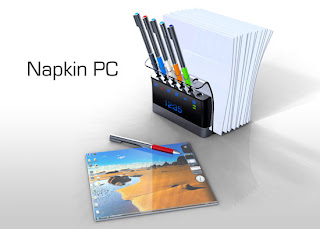
The Napkin PC is really a eye popper as it's disguised as a napkin holder. The Napkin PC has 7 different stylus pen that uses base station allows multiple user to scribble thier ideas on individual Napkin PC that ultimately interface with the base station.

The concept allows users to have to unlimited creativity to input on a Napkin PC screen. The "napkins" employs full color e-paper and multi-touch technology. That is great for multiuser who loves to start an IDEA! No more room for paper nor waste paper keep our enviroment clean and greener.

The size does come in a vaiety as for:

Napkin interface: 180mm x 180mm x 2mm
Pen stylus: 140mm x 9mm x 10mm
Base station: 160mm x 150mm x 150mm
Mobile station: 45mm x 36mm x 15 mm

Gadget Junction - Napkin PC 2009 Gadget Gadget Junction - Napkin PC 2009 Gadget Gadget Junction - Napkin PC 2009 Gadget Gadget Junction - Napkin PC 2009 Gadget Gadget Junction - Napkin PC 2009 Gadget Gadget Junction - Napkin PC 2009 Gadget Gadget Junction - Napkin PC 2009 Gadget


The technology behind it, The key technologies are full color e-Paper, multi-touch input, Inductive power circuits, and high speed RF wireless connections. The e-Paper is key because of its low power consumption, thinness and flexibility, and ability to retain an image without power. Multi-touch is simply the future of intuitive input that makes the PC fun, fast, and easy to use. The inductive power circuits are crucial because they allow wireless power transfer and make the interface Napkin simple and inexpensive enough to be used in large numbers. High speed RF continues to keep everything wireless and intuitively seamless.

The napkins can hold the image drawn on it indefinitely, or until it's cleared off by user. Which means that you can hang it up, or share it with your coworkers at your next meeting. The Napkin PC took first place Judge's Award and Chairman's Award in NextGen's PC Design Competition. That is a nice piece of gadget that everyone can share their idea's together. And I did forget the most interesting thing about the Napkin Pc is that it does not run on Battery.